Holy Deckchairs Batman! Condor reveals stripey new livery and brand image
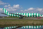
Condor revealed perhaps the bravest new livery and brand image today we’ve seen in a decade. Actively opting to shun its previous looks and celebrate its leisure market, the airline has adopted a bold new, deck chair and beach towel inspired (I kid you not) livery.
No, it’s not April 1st, and we did have to double check, but condor have done away with the usual horizontal cheat lines and traditional Eurowhite liveries for something that will certainly standout on an airport apron. To quote Condor’s press release, “Condor is vacation. And vacation is stripes.” We have to agree that Condor is evolving into a distinctive and unique vacation airline for sure.
“Condor has undergone a transformation over the past two and a half years: From a subsidiary of a vertically integrated travel group to an independent airline that looks back proudly on its history and tradition, while at the same time embarking on the path to the future. We want to express this unmistakably through our corporate identity: Condor is vacation and Condor is unmistakable – like our new design, with which we are now launching into the future,” says Ralf Teckentrup, CEO of Condor. “Our new trademark are stripes, our figurative mark stands for our origin and the colors for diversity. This triad is new, what remains is our passion. It has always made Condor unique and is therefore also reflected in our claim: Passion is our compass.”
Once you actually get over the initial shock – which as a designer seems to challenge every design rule I’ve learned – there’s something uniquely refreshing about the design. It’s taken the Braniff Calder approach to livery design with a sea of different coloured aircraft, each with its own unique identity. There’s also a careful balance of the width of the stripes which actually is considered across the entire fleet.
The conception and creation of the new brand identity came about under the direction of Remo Masala, owner of the creative agency vision alphabet in Berlin. “Revising Condor’s brand identity with its long tradition is a delicate interplay based on respect for its origins and requirements for the future. Our goal was to endow Condor with a special visual independence, the rationale of which is united in Condor’s brand essence: the invention of the vacation flight, and the effective vacation code, the stripes of summer, joy and freedom.”
The corporate identity’s lead colours are yellow and blue (not that we see much of it here). They have been complemented by the contrasting color gray. The Condor signet, the condor in a circle, goes back to one of Germany’s most influential designers, Otl Aicher. The figurative mark has been given a facelift, with finer and more dynamic lines. It can be found again in the tail unit of the aircraft. The Condor lettering has also been adapted: It is now more compact, and the new lower case has made the word mark more independent and consistent with the image. The logo appears in high-contrast black on the fuselage of the aircraft.
Funnily enough there’s hints that the airline won’t stop there. The press release says that initially, there will be five colours in a striped look: yellow, red, blue, green, and beige.
The crew uniforms, accessories such as neckerchiefs, ties and pins will shine in the new design too, which will also make its way on board, to the airports, on the website and on social media: in the coming weeks and months, many items on board will be replaced, such as cups, blankets and cutlery, as well as all materials on the ground such as boarding passes, ID cards and airport signage. The replacement will run successively, with nothing of old design being disposed of, but everything being used up. Around 80 percent of the fleet is to be repainted by 2024, because new paint jobs are due anyway. Condor is thus choosing the most sustainable way to redesign its brand identity and fleet.
The new design was unveiled in Toulouse with the first A330neo, which will take off for Condor in the fall. The first widebody will take off with green stripes. As early as tomorrow, the first Condor aircraft in the new look will be on route: the Airbus A321 with the registration D-AIAD will wear yellow stripes and fly to Lanzarote on April 5 at noon. In the upcoming weeks, five more Boeing 757 and Airbus A320/1 aircrafts will be repainted, so that six aircrafts will be flying in the new design in the summer flight schedule. They will mainly fly to Mallorca, Greece, the Canary Islands and Egypt.
It will be interesting to see if passengers warm to the new livery and brand image, and see how carefully the airline balances the stripes motif with other more stabilising block colour elements to soften the brand image. One thing for sure, Condor certainly doesn’t want to approach the summer 2022 season in anything but a riot of colour.
Condor presenta la nuova livrea (a righe)
- Autore Discussione FlyKing
- Data d'inizio
EI-MAW
Utente Registrato
- 25 Dicembre 2007
- 7,138
- 1,390
Per completezza avrei messo sui motori delle Birkenstock coi calzettoni.
Scherzi a parte, sono un po' combattuto. Una parte di me prova repulsione, una parte la trova una genialata che sa quasi un po' di Braniff anni '60-'70.
13900
Utente Registrato
- 26 Aprile 2012
- 10,302
- 8,153
Dopo aver controllato se non era il primo di aprile devo ammettere che mi piace. Ha humour, coraggio, si sdrammatizza ed e' IMHO meglio dei bianconi alla LATAM/Lufthansa/Iberia/Lingus/AF/troppi altri che ci vengon propinati ultimamente. Magari il nome della compagnia e il logo sono un po' piccini, avrei osato una specie di combinazione con i colori opposti rispetto a quelli della banda in cui la lettera cade.
In altre parole, se l'aereo e' a righe rosse e verdi avrei fatto una roba cosi: Condor in cui il background della C e' il rosso, quello della o il verde e cosi' via.
In altre parole, se l'aereo e' a righe rosse e verdi avrei fatto una roba cosi: Condor in cui il background della C e' il rosso, quello della o il verde e cosi' via.
Viking
Utente Registrato

Purtroppo dal sito ufficiale Condor è stato pubblicato proprio oggiSpero che la notizia sia stata pubblicata il 1° aprile

04 April 2022 | 10:29 Uhr

Condor mit neuem Markenauftritt: Deutschlands beliebtester Ferienflieger erfindet sich neu
Unverwechselbarkeit in einer farbenfrohen Welt der Vielfalt
Che orrore...
Un lombrico

 www.linkedin.com
Un lombrico
Aeronews on LinkedIn: New look / Condor Flugdienst GmbH Airbus A330-900 wearing the new livery.… | 131 comments
New look / Condor Flugdienst GmbH Airbus A330-900 wearing the new livery. Details + video: https://lnkd.in/eg2cxPHc Spotted in Toulouse by Eurospot… | 131 comments on LinkedIn
www.linkedin.com

flyreg
Utente Registrato
Quoto. Brutto è brutto. Però nel piattume generale di livree tutte bianche e tutte uguali degli ultimi anni, ogni livrea che ritorna ad essere creatività è da apprezzare.Dopo aver controllato se non era il primo di aprile devo ammettere che mi piace. Ha humour, coraggio, si sdrammatizza ed e' IMHO meglio dei bianconi alla LATAM/Lufthansa/Iberia/Lingus/AF/troppi altri che ci vengon propinati ultimamente. Magari il nome della compagnia e il logo sono un po' piccini, avrei osato una specie di combinazione con i colori opposti rispetto a quelli della banda in cui la lettera cade.
In altre parole, se l'aereo e' a righe rosse e verdi avrei fatto una roba cosi: Condor in cui il background della C e' il rosso, quello della o il verde e cosi' via.
A questo punto il primo che dice brutta della livrea ITA lo prendo virtualmente a schiaffi.
" a due a due finché 'un diventan dispari".
Inviato dal mio WAS-LX1A utilizzando Tapatalk
" a due a due finché 'un diventan dispari".
Inviato dal mio WAS-LX1A utilizzando Tapatalk
ploncito
Utente Registrato
Sono combattuto anche io (cit. post venexiano).
Su certi versi bruttissima, su altri cosi' assurda da risultare davvero bella
Su certi versi bruttissima, su altri cosi' assurda da risultare davvero bella
Ultima modifica:
TapiroVolante
Utente Registrato
- 13 Dicembre 2016
- 907
- 442
Orsù, cerchiamo delle motivazioni che possano spingere ad ideare cose del genere...
Una potrebbe essere questa: "facciamo gli aerei col pigiama, così i passeggeri a bordo si sentiranno a loro agio come a casa propria..."
Una potrebbe essere questa: "facciamo gli aerei col pigiama, così i passeggeri a bordo si sentiranno a loro agio come a casa propria..."
Sembra un telo mare di cattivo gusto (e il brand è difficilmente intellegibile)
Allegati
-
 137.6 KB Visualizzazioni: 74
SierraEcho
Utente Registrato
Penso nasca tutto da qui...
A me dal rendering piace molto e rende molto il messaggio che vuole dare.
Dal vivo mi piace con riserva, nel senso che il colore nel concreto è bruttino e sembra meno ricercato di come appare nel rendering.
E sicuramente il fatto che il logo non spicchi ne tanto meno la scritta è una cosa molto negativa.


