Non penso che c'entri Kingpin. Da airliners.net riporto il link a questo articolo (tradotto dal coreano via Google), con la parte rilevante in rosso:
+++++++++
It's illegal to register a trademark of the Tai Chi pattern, but what about Korean Air? - OhMyNews
It's illegal to register a trademark of the Tai Chi pattern, but what about Korean Air?
Patent Office: "There is a white space in the circle, it is different from the Tai Chi pattern"

Recently, Korean Air Executive Vice President Cho Hyun-min was excommunicated, and voices are growing louder that the company name, symbol, and logo of 'Korean Air' should be withdrawn. In particular, the controversy over the company logo and the Taeguk emblem used by Korean Air continues. In response, the Korean Intellectual Property Office said, "There is no major problem with the Korean Air logo because there is a space between the Taeguk pattern."
As of noon on the 17th, more than 70,000 people have agreed to the Blue House's petition to withdraw Korean Air's name and logo. The petitioner, who uses the Naver ID naver - ***, posted a message asking for "Korean Air not to use the name 'Daehan' and the Taeguk mark."
<OhMyNews> examined the patent information net on the same day, and found that Korean Air Co., Ltd. has registered 11 trademarks that combine the name 'Korean Air' with the Taeguk pattern. The Korean Air trademark with the Taeguk emblem was first registered in January 1985.
However, according to Article 34 of the Trademark Act, the flag of the Republic of Korea (Taegukgi) and the national emblem are trademarks that cannot be registered as trademarks. According to this provision, the Taeguk emblem on the flag of the Republic of Korea is also not eligible for trademark registration. However, Korean Air has registered a trademark for the Taeguk emblem logo.
On the 16th, the JPO replied, "There is no major problem" to a question from <OhMyNews> about whether there is any problem with the registration of trademarks for 'Korean Air' and 'Korean Air Taeguk logo'. There are two reasons for this.
It's illegal to register a trademark of the Tai Chi pattern, but what about Korean Air?
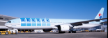
First, Korean Air's emblem is different from the Taegukgi pattern. A KIPO official explained, "Korean Air's Taeguk pattern is composed of spaced out." Korean Air's logo has a 'white' space between the red and blue semicircles.
The Taegukgi pattern is red and blue, but in the case of Korean Air, there is a space between red and blue, which is different.
Second, with regard to Korean Air's 'Daehan', the JPO said that there was no problem, saying that "the ability to distinguish by use is recognized." Korean Air was first registered in 1974. Since the name 'Korean Air' has been used for decades, there will be no confusion in the use of the name.
If a third party raises an objection to the Korean Air logo, apart from the interpretation of the Korean Air Office, it will be tried by the Patent Trial and Appeal Board. According to the Korean Intellectual Property Office, not a single appeal request related to the Korean Air trademark has yet been filed.
Cho Young-sun, a professor at Korea University, said, "If a trademark is registered, it is difficult to invalidate a trademark based only on such a reason," and "It is difficult to arbitrarily deprive a registered trademark because it is a private property property unless there is a special reason for invalidation or cancellation."
Korean Air's trademark rights are revoked, but the Korean Air brand can
be usedEven if Korean Air's trademark rights to its name and logo are revoked, it does not mean that Korean Air Inc. cannot use the brand. A trademark right grants an "exclusive right" to use a registered trademark independently.
If the trademark rights are revoked, not only Korean Air but also other companies will be able to use the trademark.
An official from the JPO said, "When a trademark is registered, it has the effect of establishing the scope of trademark rights and preventing others from using it," adding, "Even if the registration is canceled, it does not mean that the trademark cannot be used."
+++++++++
+++++++++
It's illegal to register a trademark of the Tai Chi pattern, but what about Korean Air? - OhMyNews
It's illegal to register a trademark of the Tai Chi pattern, but what about Korean Air?
Patent Office: "There is a white space in the circle, it is different from the Tai Chi pattern"
Recently, Korean Air Executive Vice President Cho Hyun-min was excommunicated, and voices are growing louder that the company name, symbol, and logo of 'Korean Air' should be withdrawn. In particular, the controversy over the company logo and the Taeguk emblem used by Korean Air continues. In response, the Korean Intellectual Property Office said, "There is no major problem with the Korean Air logo because there is a space between the Taeguk pattern."
As of noon on the 17th, more than 70,000 people have agreed to the Blue House's petition to withdraw Korean Air's name and logo. The petitioner, who uses the Naver ID naver - ***, posted a message asking for "Korean Air not to use the name 'Daehan' and the Taeguk mark."
<OhMyNews> examined the patent information net on the same day, and found that Korean Air Co., Ltd. has registered 11 trademarks that combine the name 'Korean Air' with the Taeguk pattern. The Korean Air trademark with the Taeguk emblem was first registered in January 1985.
However, according to Article 34 of the Trademark Act, the flag of the Republic of Korea (Taegukgi) and the national emblem are trademarks that cannot be registered as trademarks. According to this provision, the Taeguk emblem on the flag of the Republic of Korea is also not eligible for trademark registration. However, Korean Air has registered a trademark for the Taeguk emblem logo.
On the 16th, the JPO replied, "There is no major problem" to a question from <OhMyNews> about whether there is any problem with the registration of trademarks for 'Korean Air' and 'Korean Air Taeguk logo'. There are two reasons for this.
It's illegal to register a trademark of the Tai Chi pattern, but what about Korean Air?
First, Korean Air's emblem is different from the Taegukgi pattern. A KIPO official explained, "Korean Air's Taeguk pattern is composed of spaced out." Korean Air's logo has a 'white' space between the red and blue semicircles.
The Taegukgi pattern is red and blue, but in the case of Korean Air, there is a space between red and blue, which is different.
Second, with regard to Korean Air's 'Daehan', the JPO said that there was no problem, saying that "the ability to distinguish by use is recognized." Korean Air was first registered in 1974. Since the name 'Korean Air' has been used for decades, there will be no confusion in the use of the name.
If a third party raises an objection to the Korean Air logo, apart from the interpretation of the Korean Air Office, it will be tried by the Patent Trial and Appeal Board. According to the Korean Intellectual Property Office, not a single appeal request related to the Korean Air trademark has yet been filed.
Cho Young-sun, a professor at Korea University, said, "If a trademark is registered, it is difficult to invalidate a trademark based only on such a reason," and "It is difficult to arbitrarily deprive a registered trademark because it is a private property property unless there is a special reason for invalidation or cancellation."
Korean Air's trademark rights are revoked, but the Korean Air brand can
be usedEven if Korean Air's trademark rights to its name and logo are revoked, it does not mean that Korean Air Inc. cannot use the brand. A trademark right grants an "exclusive right" to use a registered trademark independently.
If the trademark rights are revoked, not only Korean Air but also other companies will be able to use the trademark.
An official from the JPO said, "When a trademark is registered, it has the effect of establishing the scope of trademark rights and preventing others from using it," adding, "Even if the registration is canceled, it does not mean that the trademark cannot be used."
+++++++++